Furniture is one of the hardest categories to sell online. Shoppers can’t sit on a sofa through a screen, and they can’t measure a dresser with their hands. They make the entire decision from your photos — and if those photos lie, mislead, or leave gaps, the sale is gone before they add to cart. Below are the furniture photo mistakes that hurt conversions the most on Amazon, Wayfair, Etsy, eBay, and Shopify — and how to fix each one without blowing up your photography budget.
Quick Answer
The most costly furniture photo mistakes are missing scale cues, flat lighting, white-background-only galleries, inconsistent angles across a catalog, no close-up detail shots, and color drift between the photo and the real product. Scale errors hurt conversion on the product page — buyers cannot commit without knowing size. Color drift hurts after checkout, driving post-purchase returns that cost triple what they would for small items. Lighting mistakes and missing detail shots sit in the middle: they lower perceived quality before the buyer even scrolls the gallery.
Fix in this order: scale first — 42% of shoppers try to judge product size from images alone, and 28% of furniture sites fail to provide a single in-scale photo (Baymard Institute). Then lighting, then catalog consistency. These three together fix the conversion floor for almost any SKU with furniture photo mistakes, before you touch anything fancier. Every furniture photo mistake in this guide maps to a specific marketplace rule or Baymard-tested UX finding, so you know the fix is worth the reshoot budget.
Mistake 1: Hiding the Scale of the Piece
Of the furniture photo mistakes we see sellers repeat, the single most expensive is publishing a sofa, dresser, or bookshelf on a plain background with no size reference. The product looks floating. A 72-inch sectional and a 54-inch loveseat are indistinguishable when both are centered on white.
Baymard Institute’s large-scale UX testing found that 42% of users will try to gauge the size of a product directly from its images, and 28% of furniture sites fail to provide a single in-scale photo that would make this possible (Baymard: In-Scale Product Images). When the image fails, shoppers either bounce or order the wrong size — which turns into a return.
What to show instead: at least one image of the piece next to a human model, another next to a recognizable object (a standard door, a dining chair, a coffee mug), and a dimension diagram with the measurements labeled directly on the image.Baymard specifically recommends a dedicated dimensions image with measurement arrows overlaid on the product, because textual dimensions alone are not enough — most test participants could not map 34 x 82 x 36 inches back to the correct parts of a piece (Baymard: Dimensions Image).
Mistake 2: Flat, Shadowless Lighting That Kills Texture
Overhead fluorescent light or a single on-camera flash flattens wood grain, erases fabric weave, and makes leather look like vinyl. Buyers can’t feel texture through a screen, so they infer it from how light hits the surface. If light hits every part of the product evenly from the front, there is nothing to infer.
Side lighting is what reveals material. Soft light from the side casts micro-shadows that surface small details — fabric weave, embossing, stitching, wood grain — and those details are what communicate quality to a buyer scanning at thumbnail size (Squareshot: Light for Product Photography). Over 75% of online shoppers rank product images as the most important factor in a purchase decision, which means flat lighting is directly leaving money on the table (Brand Vision: Photography Techniques).
Quick fix: shoot near a large window with sheer curtain diffusion, with the light hitting the product at roughly a 45-degree angle. Add a white foam board on the opposite side to bounce fill light. No studio needed.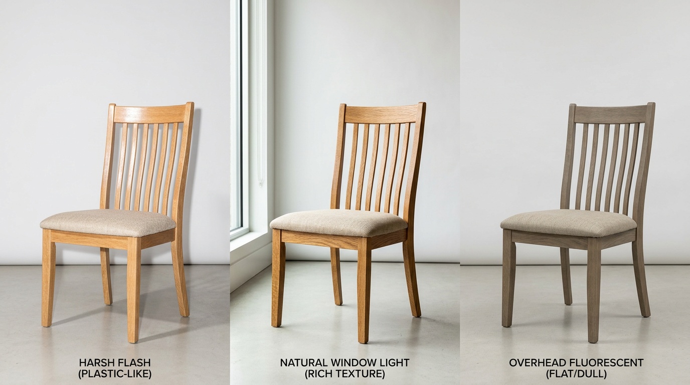
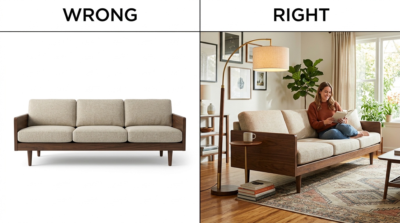
Mistake 3: White Background Only, No Room Context
Amazon and Wayfair both require a pure white, isolated main image. Amazon’s rule is an 85%-fill white-background main shot (Amazon Seller Central: Product image guide), and Wayfair mirrors it with its own silhouette-plus-environmental mix (Wayfair: Imagery 101). The mistake is stopping there.
A white-background shot proves what the piece is. A lifestyle shot proves what life with the piece feels like. Without lifestyle images, buyers cannot picture the sofa in their own living room, and the cart sits empty. Shopify’s own photography guidance recommends at least one lifestyle or in-use shot per product, on top of the catalog silhouette (Shopify: Ecommerce Photography).
40%Higher conversion for sofas with lifestyle images vs. white background onlySource: OmniRoom Sofa Staging PlaybookIf shooting full room sets for every SKU is out of budget, this is where AI staging helps. OmniRoom’s Multirooms generates multiple room contexts — modern loft, coastal, farmhouse — from a single white-background product shot, so you get the lifestyle library without booking a photo studio.
Mistake 4: Inconsistent Angles Across Your Catalog
Inconsistency is one of the most overlooked furniture photo mistakes because each individual shot may still look fine. Buyers browse marketplaces as grids. When they scroll your Amazon or Wayfair storefront, all thumbnails render at the same size side by side. If one sofa is shot head-on, another from a three-quarter angle, a third from above, and a fourth tilted — the catalog looks unfinished, even if each individual photo is sharp.
Shopify’s photography guidance is blunt on this: a catalog where every image has the same angle, background, and crop looks more professional than a catalog with one spectacular shot surrounded by inconsistent ones (Shopify Product Photography Guide). Batch consistency beats individual brilliance when buyers compare across a grid.
MistakeWhere It HurtsTypical FixNo scale referenceConversion + wrong-size returnsAdd 1 dimension diagram per SKUFlat lightingPerceived quality, trustReshoot with side + fill lightNo lifestyle contextEmotional connection, PDP bounceAdd 2-3 room-context shotsInconsistent anglesCatalog trust, brand signalLock a 6-angle standardNo detail shotsQuality perception, Etsy rankAdd 2 macro shots per SKUColor driftReturns, bad reviewsCalibrate white balance + monitorA workable standard for furniture: front, three-quarter left, three-quarter right, back, overhead, and one close-up — applied to every SKU, every shoot. OmniRoom’s Multi-Perspective and Move Cam features lock this angle set automatically so the catalog stays visually consistent even when products are shot at different times by different people.
Mistake 5: Missing Close-Up Detail Shots
Of all the furniture photo mistakes this list covers, missing detail shots is the one that quietly lowers perceived price. The difference between a $180 dining chair and a $900 one is usually in the joinery, the stitching, the finish — the details a thumbnail cannot show. Skipping detail shots means you are asking the buyer to trust the price tag with no evidence.
Etsy explicitly expects detail shots as part of the listing standard. Their guidance recommends using all 10 image slots, with slot 3 dedicated to close-ups of texture, hardware, stitching, and joinery (Etsy: Listing Image Best Practices). Wayfair similarly asks for multiple high-resolution environmental and silhouette shots to help customers virtually touch the product (Wayfair Imagery 101).
At a minimum, publish two macro shots per SKU: one on the material (wood grain, fabric weave, leather pebble), one on the craftsmanship (a joint, a weld, a seam, a zipper). Shoot them at 2,000 pixels or higher so the zoom feature on each marketplace works — Amazon and Wayfair both want a 2,000 x 2,000 minimum for zoom to activate (Squareshot: Amazon Image Dimensions).
Mistake 6: Color Drift Between Photo and Product
Color drift is quietly the most expensive of the furniture photo mistakes on this list because it does not hit on the product page — it hits after the order. A walnut stain that photographs slightly orange, a sage green velvet that renders teal, a cream rug that looks yellow on one monitor and gray on another. The buyer receives the piece, the color does not match, they return it. You pay the freight twice.
Furniture sits in the high end of ecommerce return rates. Industry data puts furniture return rates at 15-20%, with some categories hitting 23% — and color mismatch is consistently named among the top three return reasons, behind only size issues and damage (UpCounting: Average Ecommerce Return Rate). Each furniture return costs far more than a $20 T-shirt return because of freight, inspection, and restocking.
What to check: calibrate your monitor, use a gray card in every shoot for white balance, avoid mixing daylight and tungsten bulbs in the same session, and proof the final images on a phone screen — most buyers will see your listing on mobile, not a calibrated desktop.If you use AI-generated lifestyle images, run a manual color QA against the hero white-background shot before publishing — the hero is the ground truth, everything else must match it. OmniRoom’s White BG Angles output is designed to preserve hero color across generated variants, but any AI pipeline still needs a human color check before the SKU goes live.
Frequently Asked Questions
How many product photos should a furniture listing have?
Use the full slot allowance. A strong furniture listing has: 1 white-background main, 3-4 lifestyle shots, 2 detail macros, 1 dimension diagram, 1 scale reference, and 1 short video. That covers what a buyer asks before add-to-cart.
Do I really need lifestyle shots if I am selling on Amazon?
Yes. Amazon requires a white-background main image, but the secondary slots are where you sell. Shoppers who cannot picture the sofa in their own room bounce regardless of price. Listings with lifestyle secondary images consistently outperform all-silhouette listings on conversion (Brand Vision).
Is AI-generated furniture staging allowed on Amazon, Wayfair, and Etsy?
Amazon and Wayfair permit AI-staged lifestyle images in secondary slots as long as the product itself is the real, unaltered product. Etsy is stricter — it requires original photos of the actual item, so AI staging is best kept off Etsy main images (Etsy Image Policy). Always check the latest platform terms before publishing.
What resolution do I need for marketplace zoom features to work?
Amazon and Wayfair both require at least 2,000 pixels on the longest side for zoom to activate; 1,000 pixels is the hard minimum for acceptance (Squareshot: Amazon Dimensions). Etsy also recommends 2,000 pixels for zoom. Shoot at the highest resolution you have, then downscale — never the reverse.
How do I stop color drift in my furniture photos?
Three habits fix most drift: shoot a gray card every session to set white balance in post; keep light sources at the same color temperature; and calibrate your monitor or proof final images on a phone before upload. For critical pieces like velvets or pastels, add a short color note and reference a calibrated swatch.